 Dineora


 Restaurant
 Location
 Cuisine
 Designed by Dineora
A Ville nouvelle fast-food place that claims the crunch
Crunch House is a fast-food place in the Ville nouvelle of Fez. Its logo, a roof topped with a flaming chimney, carries a motto in English: “Home of the creamy crunch”. The menu fits into twelve sections: sandwiches on traditional bread, such as the Chicken Sandwich with marinated chicken or the Cesar Crispy; burgers, from the Cheesy Beef to the Volcano Burger and the Mushroom Melt; ciabattas; salads, including a Caesar salad; basmati rice bowls — Mushroom Chicken, Korean Crunch, Cheesy Chicken, Crispy Bowl.
Next come French tacos in several sizes, with chicken, cordon bleu, ground meat, tenders or mixed, Crunch Bowls, wraps, then the sides — homemade fries, potato wedges, cheesy fries, mozza sticks, onion rings —, extras such as cheddar or crispy onions, a long list of sauces, from algérienne to samouraï by way of fromagère, and drinks.

The challenge: making the “crunch” heard
 The challenge: making the “crunch” heard
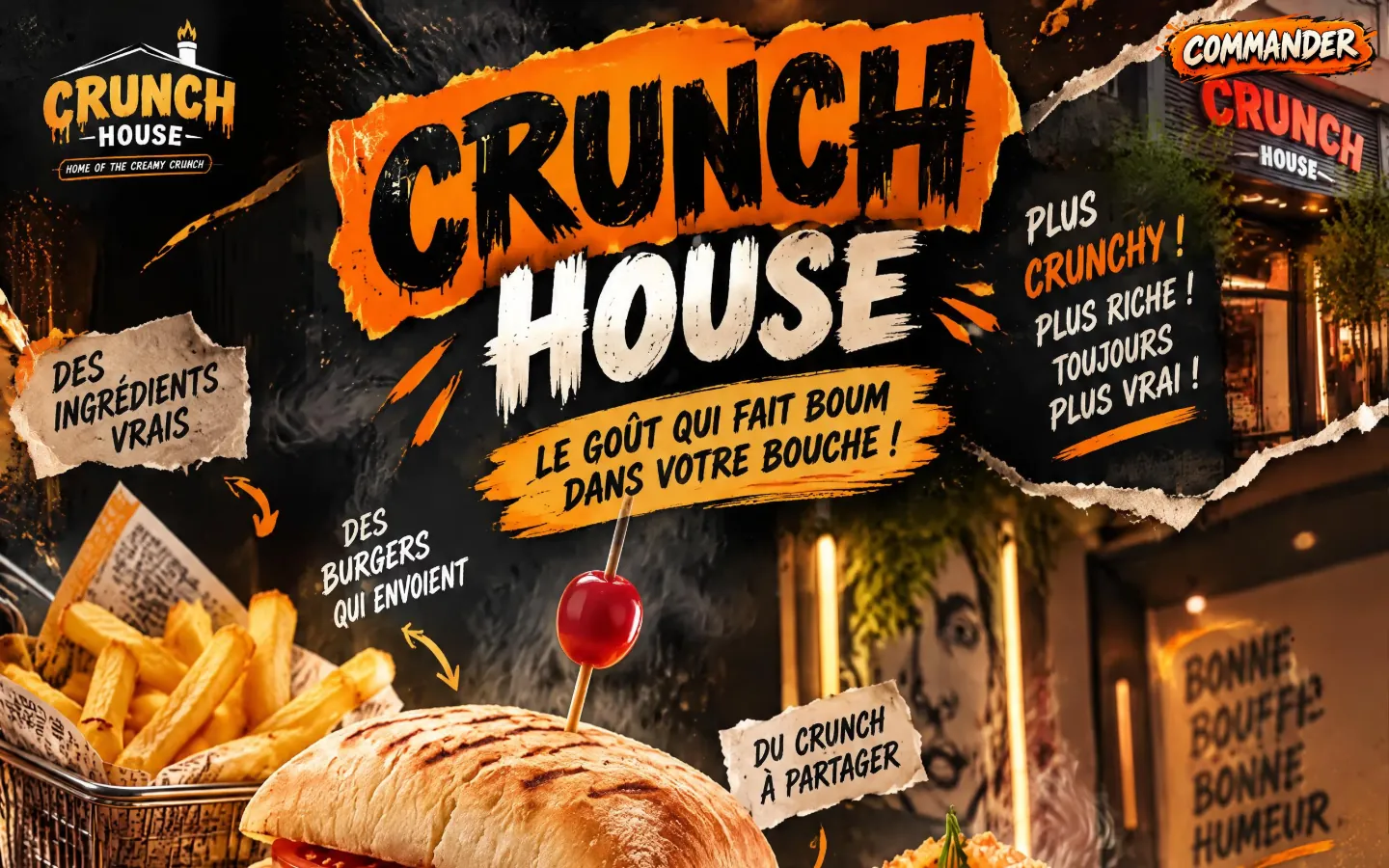
Crunch House has a tone: direct, playful, full of energy. Its homepage announces it without detour: “Le goût qui fait boum dans votre bouche !” (the taste that goes boom in your mouth!). The aim was to bring that voice and that crunchy side to the screen, without letting the energy blur the essentials: a wide menu of twelve sections that has to be quick to browse.
The website also had to lead simply to ordering, for takeaway or delivery. A single button, Commander, therefore stays at the top of the screen throughout the visit, on a computer as on a phone.
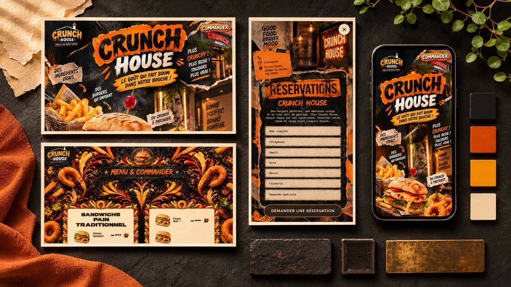
Black, orange and torn paper
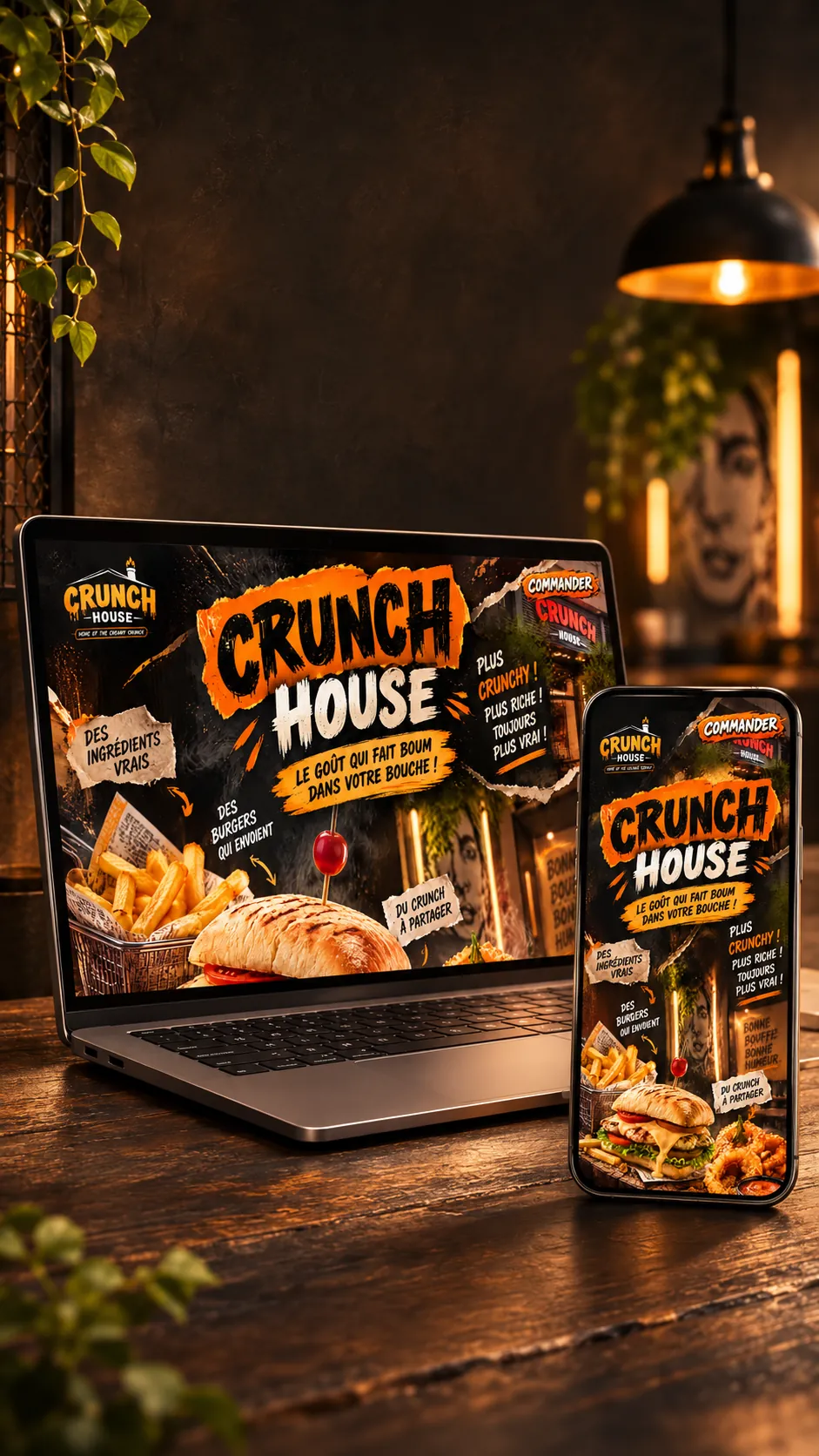
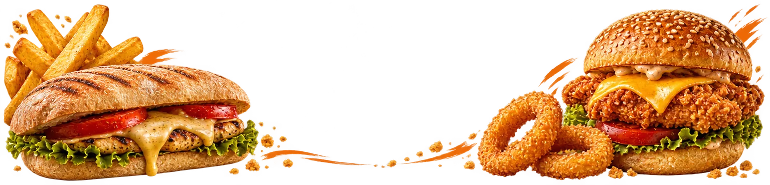
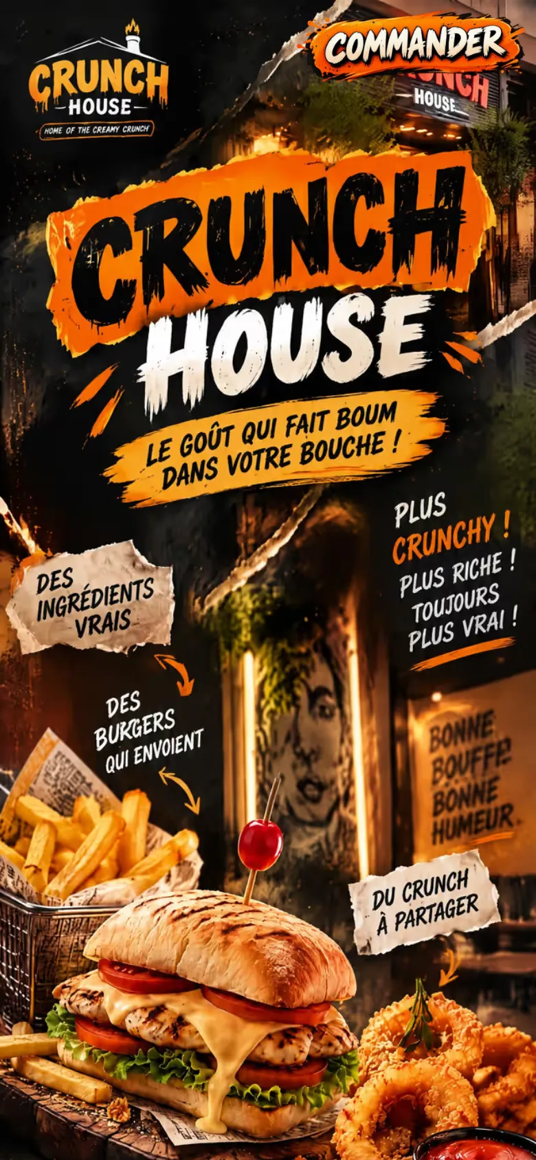
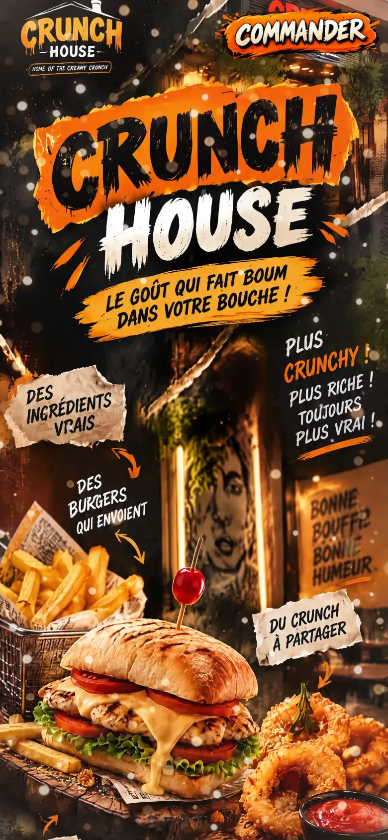
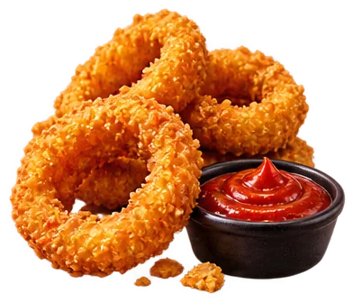
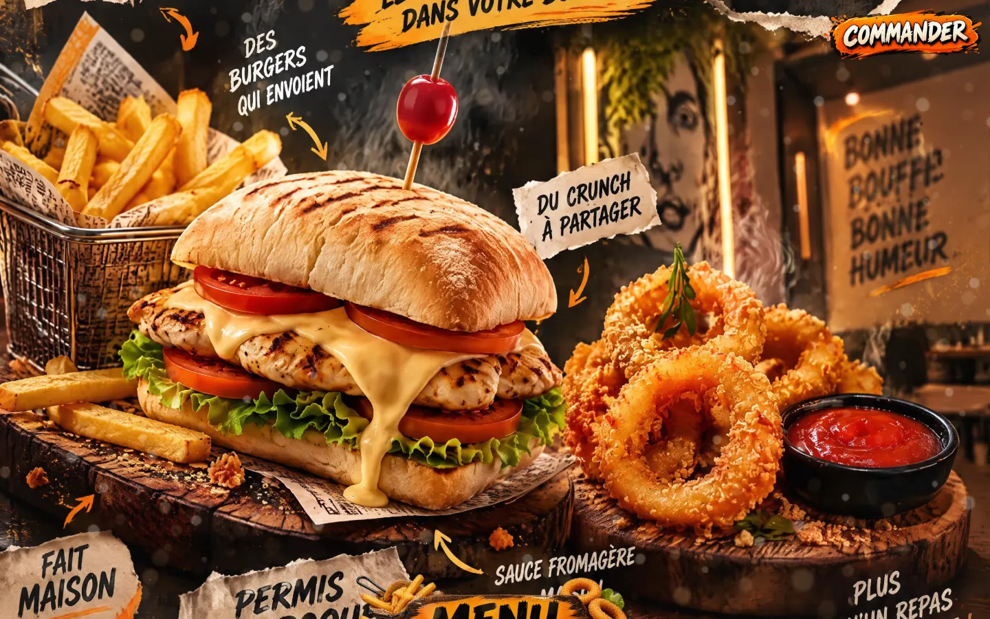
The palette is that of a street poster: charcoal black background, bursts and brushstrokes in bright orange, torn kraft paper. The visuals stage the dishes on boards of dark wood: a toasted-bread sandwich filled with chicken, tomato, lettuce and dripping cheese sauce, fries in a metal basket on newspaper, golden onion rings with their ketchup, a wrap overflowing with sauce. In the background you can make out a storefront with a lit sign, a large painted portrait on the wall and the inscription “Bonne bouffe, bonne humeur” (good food, good mood).
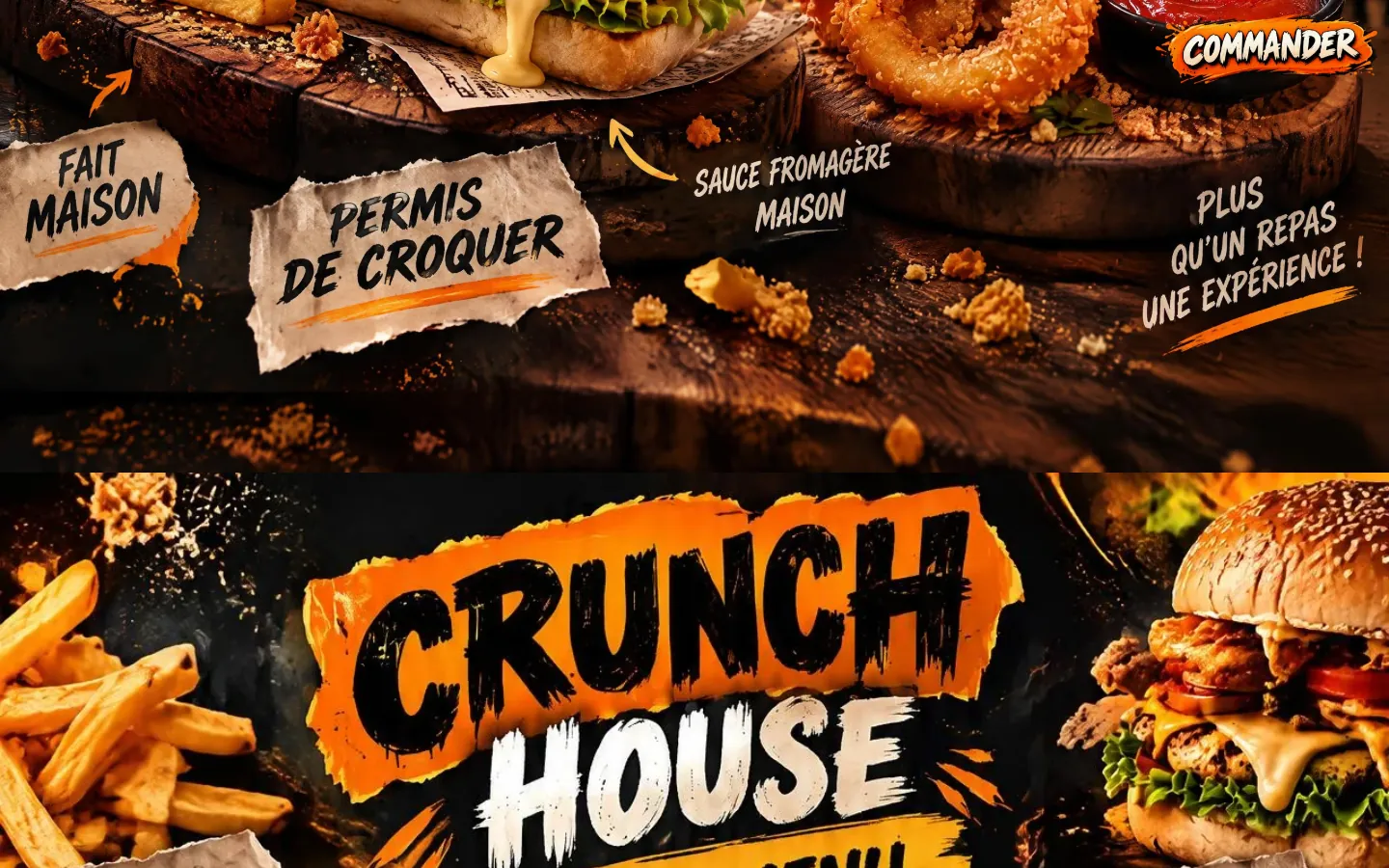
The restaurant's name is written in large brush-drawn capitals, black on an orange band then white, and small handwritten notes on torn paper surround it, linked to the dishes by arrows. The Commander button is painted in the same spirit: white letters outlined in black on an orange brushstroke.

A homepage that reads like a poster, then like a blackboard
 A homepage that reads like a poster, then like a blackboard
The homepage opens on the poster: the name in giant letters, “Le goût qui fait boum dans votre bouche !” and, around it, notes stuck on like labels: “Des ingrédients vrais”, “Des burgers qui envoient”, “Du crunch à partager”. Further down, the sandwich and the onion rings come closer, accompanied by “Fait maison”, “Permis de croquer”, “Sauce fromagère maison” and “Plus qu’un repas, une expérience !”.
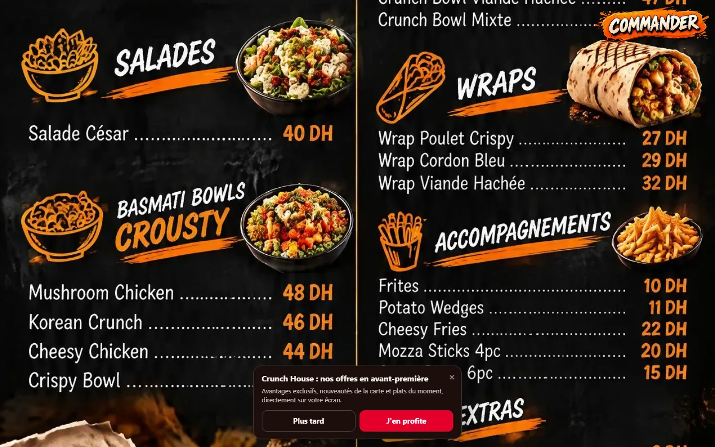
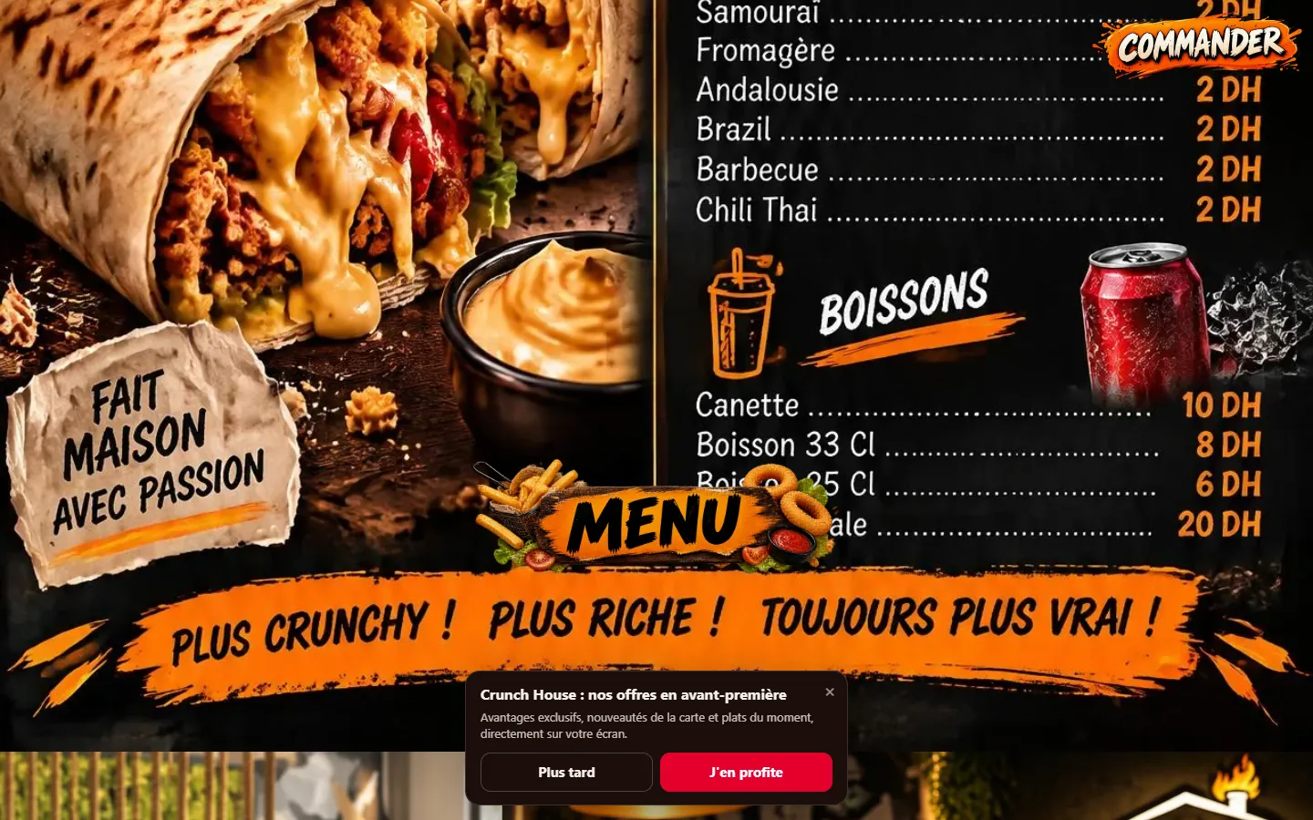
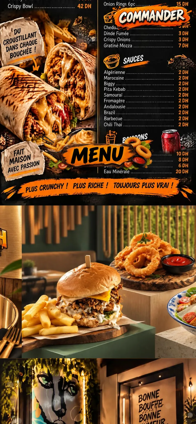
Next comes the menu, painted like a large blackboard with orange pictograms: salads, basmati rice bowls, wraps, sides, extras, sauces and drinks, each with its list and its prices. An orange band closes it on “Plus crunchy ! Plus riche ! Toujours plus vrai !”. Lower down, a dining room with wooden slats and dark green walls welcomes a burger, its fries and its onion rings.
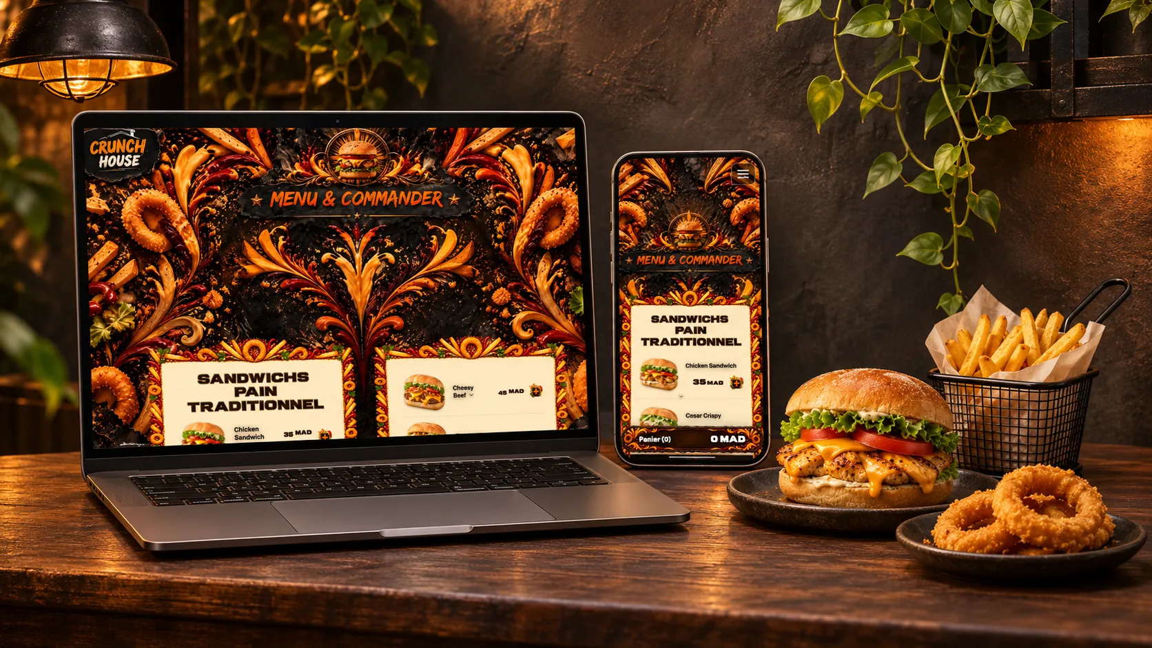
An ordering page framed with fries and onion rings
 An ordering page framed with fries and onion rings
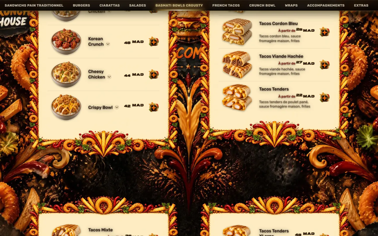
The ordering page opens under a golden medallion decorated with a burger and on the title “Menu & Commander”, written in orange brush on a torn black band. Around it, the decor plays with the menu itself: swirls of cheese sauce and ketchup, fries and onion rings arranged like ornaments.
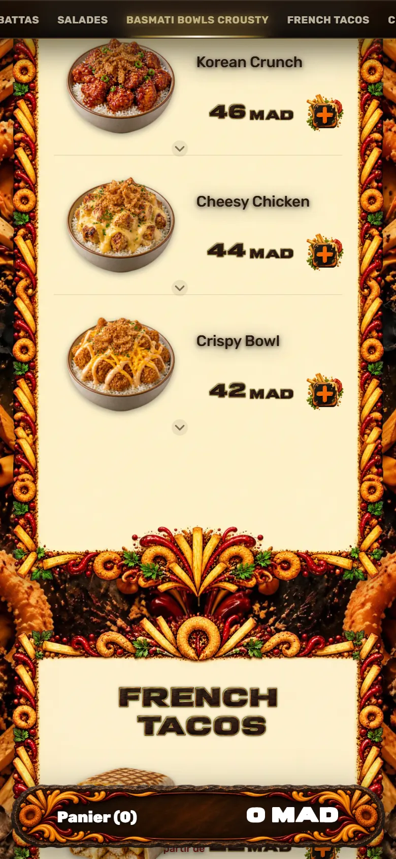
The menu is read on cream cards whose frames are made of fries, onion rings, chili peppers and herb leaves. A section bar at the top of the screen leads straight to the sandwiches, the burgers, the ciabattas, the salads, the bowls, the French tacos, the wraps, the sides and the extras. Each item has its visual, its name, its price and often the list of its ingredients; a small black square marked with an orange cross adds it to the cart. Customers build their order, choose pickup at the restaurant or delivery, and can pay online.
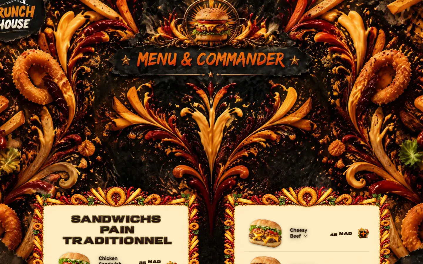
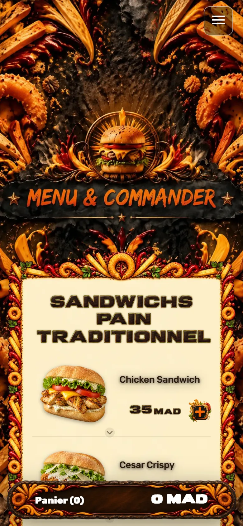
Crunch House's menu: a few dishes
 Crunch House's menu: a few dishes
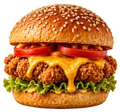
Dishes as they appear on Crunch House's online menu, with the restaurant's own names, descriptions and prices.
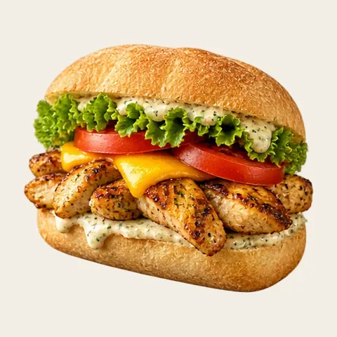 Sandwichs Pain Traditionnel
Chicken Sandwich
Poulet mariné, cheddar, laitue, tomate, sauce maison
35 MAD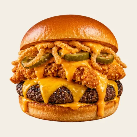 Burgers
Volcano Burger
Steak haché grillé, cheddar, poulet crispy, oignons crispy, cornichons, sauce fromagère, sauce burger
50 MAD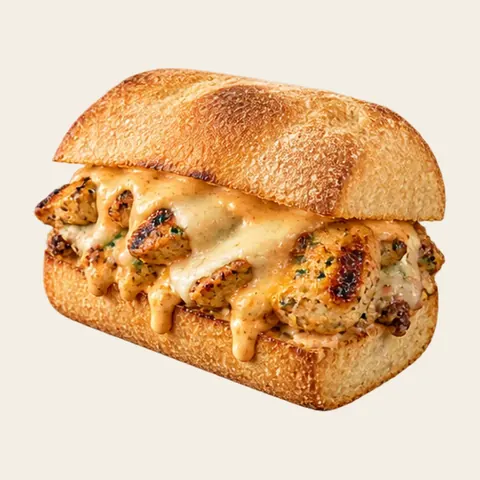 Ciabattas
Chicken Ciabatta
Poulet mariné, fromage, sauce maison sur pain ciabatta
35 MAD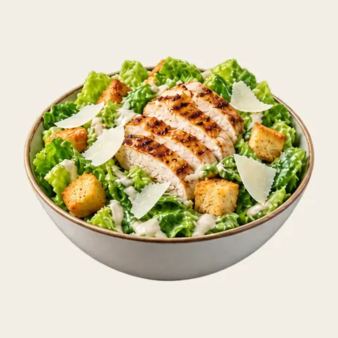 Salades
Salade César
Laitue, poulet grillé, copeaux de parmesan, croûtons et sauce César maison
40 MAD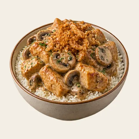 Basmati Bowls Crousty
Mushroom Chicken
Riz basmati, poulet mariné, champignons sautés, sauce crémeuse, oignons crispy
48 MAD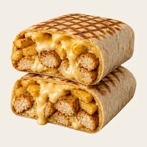 French Tacos
Tacos Poulet
Tacos poulet, sauce fromagère maison, frites
22 MAD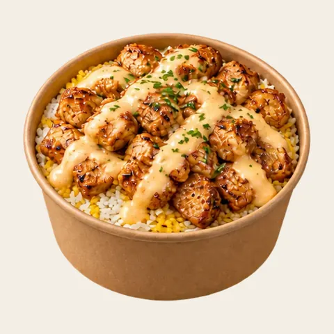 Crunch Bowl
 Poulet Mariné
Riz ou base croustillante, poulet mariné, sauce fromagère maison
37 MAD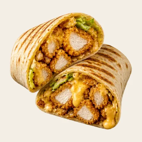 Wraps
Wrap Poulet Crispy
Poulet crispy, sauce fromagère maison
27 MAD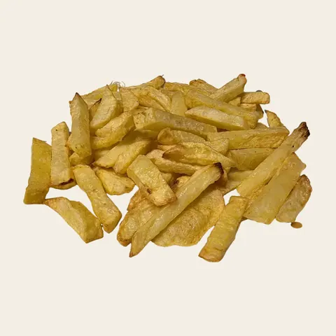 Accompagnements
Frites
Frites maison
10 MAD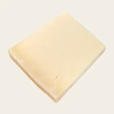 Extras
Cheddar
Supplément cheddar
3 MAD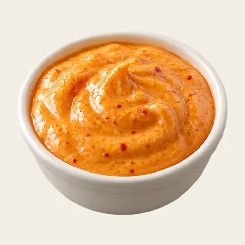 Sauces
Algérienne
Sauce algérienne épicée
2 MAD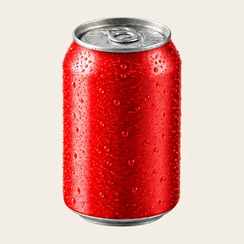 Boissons
Canette
Canette de soda 33 cl
10 MAD

On the phone, the poster stands upright
 On the phone, the poster stands upright
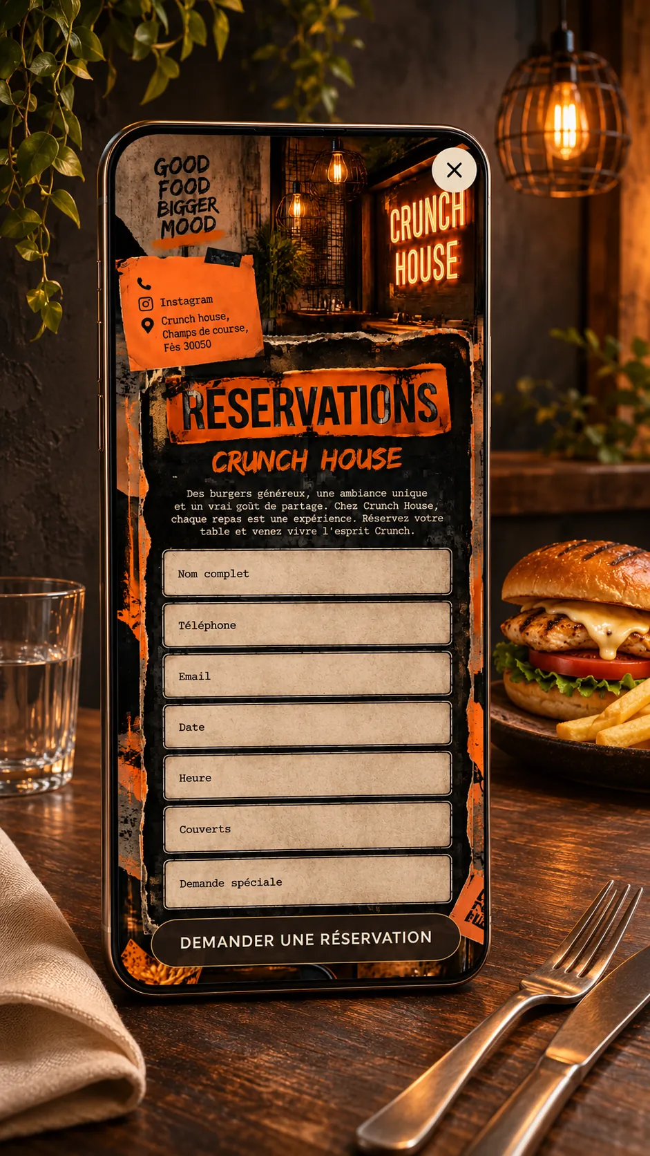
On the phone, the poster rearranges itself in height: the logo on the left and the Commander button on the right, then the name in giant letters, the motto and the torn notes that run down to the sandwich and the onion rings. The menu board keeps its two columns, tightened to the width of the screen, before the dining room with green walls and the inscription “Bonne bouffe, bonne humeur”.
On the ordering page, the cards stack one after another in their frames of fries, the section bar scrolls horizontally at the top, and a “Panier” bar, also edged with onion rings and swirls, stays at the bottom of the screen with the order total.
A website prepared for local searches
 A website prepared for local searches
The website is built around what people look for in Fez: a fast-food place or a restaurant in the Ville nouvelle or near the racecourse, a burger, French tacos, a sandwich, or simply the Crunch House menu. The page title, its description and its texts present the restaurant, its neighborhood, its cooking and its dishes in the same words, for visitors and search engines alike.
A detailed presentation page complements the homepage, and the full menu can be read as text on the ordering page. No one can promise a place on Google: what can be worked on is accurate, structured and consistent information.

A website for a fast-food restaurant in Fez: burgers, French tacos and delivery online
 A website for a fast-food restaurant in Fez: burgers, French tacos and delivery online
In Fez, a fast-food restaurant plays out in the evening and at weekends, with students and families from the Ville Nouvelle who want a burger, a French tacos or a basmati rice bowl and want it delivered. A fast-food website in Fez must therefore fit twelve menu sections without drowning anyone: traditional-bread sandwiches, ciabattas, wraps, crunch bowls, sides, extras and above all a long list of sauces from algérienne to samurai. Crunch House has it, with online ordering, pickup and delivery.
Budget first: a fast-food place has no agency money to spare, and here it needs none, since Dineora takes no commission on orders. Speed next: give the brand’s name and the menu and ordering pages appear within minutes, and the manager sees the site straight away. Then the made-to-measure part, because Crunch House looks like nobody else: charcoal-black background, bright orange brushstrokes, torn kraft paper and handwritten notes with arrows pointing at the dishes, like a street poster.
The owner changes a burger, a price or a sauce himself; orders and online payment go straight to the kitchen, with no delivery app or agency in the middle; and the software, which speaks several languages, also serves fast-food places in Lausanne, Lisbon or Sydney. For a Fez fast-food restaurant, it is a site with the look of the street and the menu of a real burger bar.
Dineora in numbers: 0% commission on your orders · a website live in 5 minutes.
Learn more: Restaurant website builder · Online ordering system for restaurants · QR code menu for restaurants
The outcome: a website with crunch
 The outcome: a website with crunch
The Crunch House website speaks like the restaurant: loud, cheerful, straight to the point. It turns the menu into a poster and the ordering page into a decor of fries and sauces, while keeping the essentials simple: choose, order, take away or have it delivered. That is what Dineora looks for in every website: that it looks like the restaurant, right down to its tone, and works day to day.


The website in pictures
 The website in pictures
Screenshots of the live website, on a computer and on a phone.
Crunch House: practical information
 Crunch House: practical information
- Address
- Champs de course, Fès 30050
See the address on Google Maps - Cuisine
- Fast food: burgers, French tacos, sandwiches
- Services
- Online ordering for pickup · Delivery · Online payment
- Menu sections
- Sandwichs Pain Traditionnel · Burgers · Ciabattas · Salades · Basmati Bowls Crousty · French Tacos · Crunch Bowl · Wraps · Accompagnements · Extras · Sauces · Boissons
- The restaurant's website
- dineora.io/crunch-house
 Menu sections
Questions about this project
 Questions about this project
Who designed the Crunch House website?
The Crunch House website was designed by Dineora: art direction, homepage, online menu and an ordering page for takeaway or delivery.
Can you order from Crunch House online?
Yes. The ordering page presents the whole menu: you add your items to the cart, then choose pickup at the restaurant or delivery, with online payment.
What is on the Crunch House menu?
Sandwiches on traditional bread, burgers, ciabattas, salads, basmati rice bowls, French tacos, wraps, sides, extras, sauces and drinks.
How does a fast-food place keep a twelve-section menu readable, sauces included?
By giving each section its own place and image, from sandwiches to sauces, and letting customers build an order in a few taps. The manager removes or adds a product himself.
Can a fast-food restaurant deliver and take payment online without a delivery app?
Yes: the site takes the order, the online payment and the choice between pickup and delivery, directly for the restaurant. Dineora takes no commission.
 Gioia
 Instafood Rabat
 La Sqala
 Les Halles
 De Vimaen Thai Cuisine - Sushi
 El Cucho
